You’ve read Building a StoryBrand. You’ve highlighted the best parts, you understand why clarity is king, and you might even have a rough BrandScript typed out.
But then you look at your own website and you hit a wall.
Understanding the theory of clear messaging is one thing. Translating that into pixels, layout, and user interface is completely different.
Many business owners get stuck in this gap. They know their website is confusing, but they don't know what a StoryBrand website actually looks like in practice.
Because the framework is so popular, there are plenty of people talking about it, but fewer tangible examples of how it translates to a live, functioning site.
Below, we’re going to deconstruct real-world StoryBrand website examples.
These aren’t just pretty designs. They’re strategic builds designed to help businesses get more of the clients they actually want.
What distinguishes a StoryBrand Website?
Before we look at the examples, it’s helpful to know what you are looking for.
- The Header Answers 3 Questions: Within five seconds, the user knows exactly what you do, how it makes their life better, and what they need to do to buy it.
- The Buy Now Button is Obvious: The Direct Call to Action (CTA) is usually in the top right and the centre of the screen, often in a contrasting colour.
- It’s Skimmable: Large blocks of text are the enemy. StoryBrand websites use short headlines, bullet points, and icons to make the content digestible.
- The Customer is the Hero: The imagery focuses on the customer’s success (smiling people enjoying the result), not just the building or the machinery.
Let’s look at how this plays out in the wild.
6 StoryBrand website examples deconstructed
Here is a breakdown of projects we’ve worked on, analysing the specific problems the business faced and how the StoryBrand framework solved them.
1. Pure Power (Solar energy)
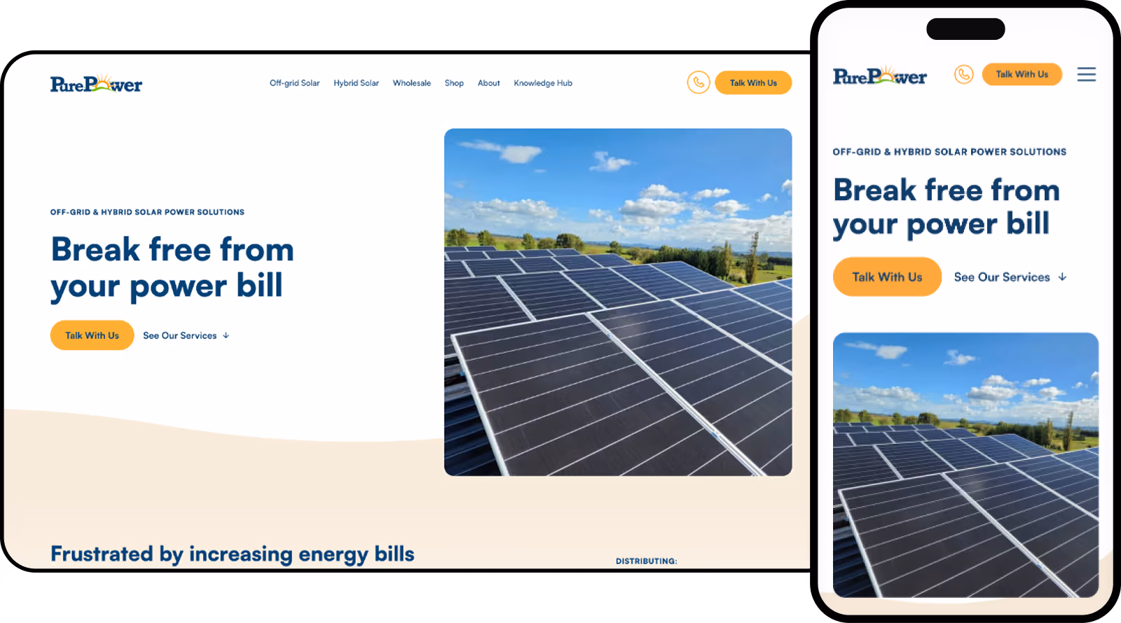
The Challenge: The solar market is crowded. Pure Power needed to distinguish themselves from just another solar company. Their old website was text-heavy and focused on the hardware, with a generic headline that read "High-Quality Solar Power Systems."
They were facing a classic Internal Problem for their customers: feeling "overwhelmed" and "frustrated" by the complexity of the grid. They needed to pivot the message from technical specs to lifestyle freedom.
The StoryBrand Fix:
- The Headline Flip: We threw out the technical jargon. We identified that the customer's core desire (Success Bucket) was Freedom and Independence. We changed the headline to a clear, aspirational promise: "Break free from your power bill."
- The Plan: We simplified their process into a clear 3-step plan (Schedule a meeting, We find the right solution, We install) to remove the fear of making an expensive mistake.
- The Data: The results illustrate the power of clarity. On their dedicated off-grid page, the average engagement time jumped from 33 seconds to over 1 minute. Even more impressive, their wholesale page saw engagement times triple, proving that when you structure information clearly, people actually stop to read it.
2. Lockerbie Estate (Property development)
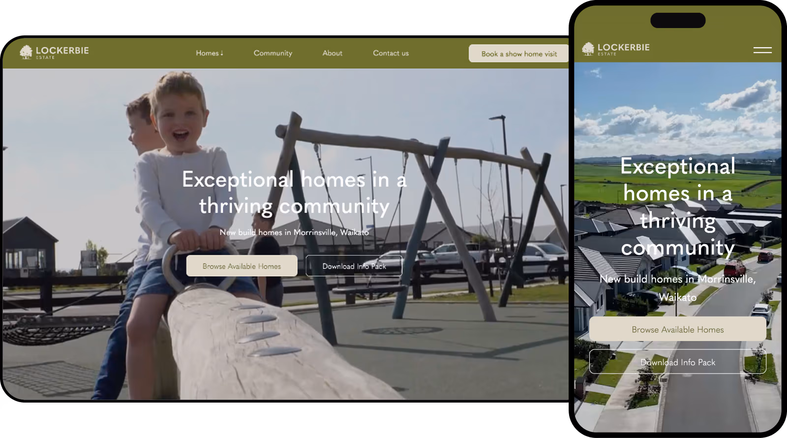
The Challenge: Lockerbie Estate had a beautiful development, but their previous website suffered from an identity crisis. They had multiple different buyer personas (from first-home buyers to retirees) and the message was getting muddled. They weren't clear on the specific problem they solved, and critically, the site lacked clear calls to action. It was a brochure site that looked nice but didn't drive behaviour.
The StoryBrand Fix: We stripped back the complexity to create a consistent message that resonated across all buyer types: the desire for a thriving community.
- The Wireframe: Interestingly, we didn't build the final site code for Lockerbie. We provided the wireframes and the copy. This is the blueprint phase of StoryBrand. We confirmed that before a single pixel was designed, the structure led the user naturally toward the Visit Showhome CTA.
- The Result: The site retains its high-end aesthetic but now functions as a sales tool, with clear pathways for users to book viewings and secure properties.
3. Groundcover Landscaping (Trade & construction)
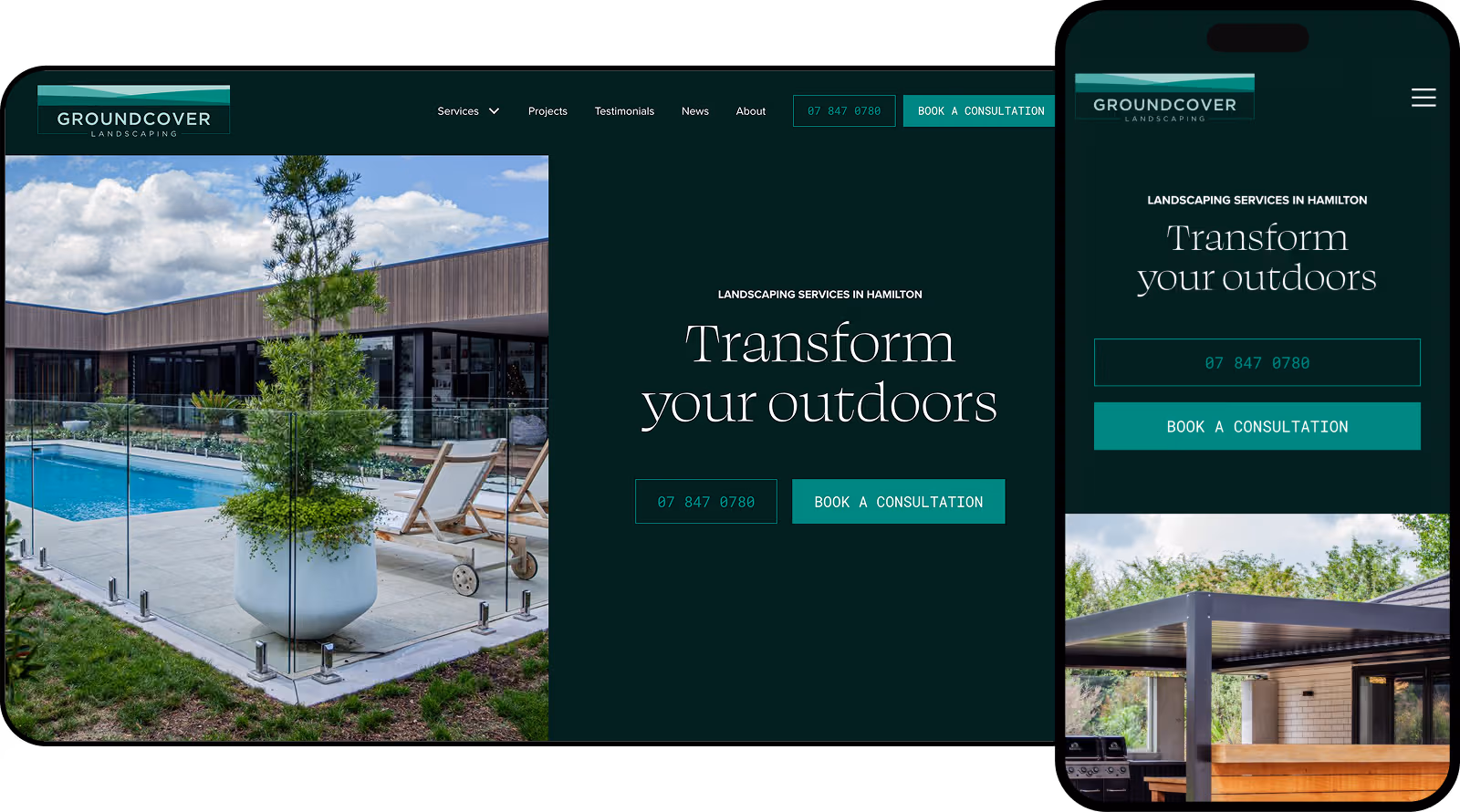
The Challenge: Groundcover Landscaping had an aspirational site, but it was attracting the wrong people. They were inundated with tyre kickers and leads that weren't a good fit. Furthermore, the owner wanted to pivot the perception of the business. They needed to make it explicitly clear that they specialise in landscaping construction (working alongside designers to bring visions to life) rather than just general gardening or maintenance.
The StoryBrand Fix:
- Qualifying through Clarity: We used the headline in the Services section "Trusted Landscape Construction" to immediately qualify the visitor. We used the Plan section of the framework to clearly outline their process. By being specific about who they help (people with a design vision ready to build), we naturally filtered out low-quality leads.
- Visual Authority: We kept the site epic and visual (essential for landscaping) but overlaid it with punchy, direct copy that positioned them as the Guide who executes the plan.
4. Michael Philpott (Personal brand/speaker)
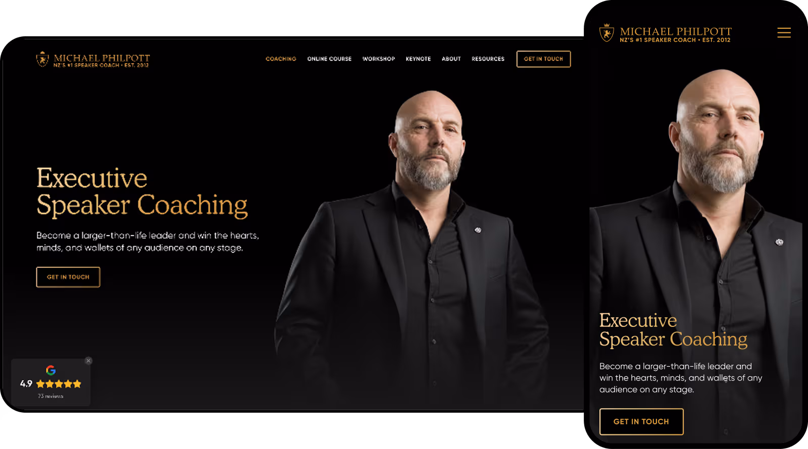
The Challenge: Michael Philpott is a high-level public speaker, and in his industry, clarity is currency. His old website was looking tired and didn't reflect the energy he brings to the stage. He needed a visual refresh, but more importantly, he needed to synthesise his keynotes into soundbites that a website visitor could grasp in seconds.
The StoryBrand Fix:
- Collaboration & Soundbites: This was a true collaboration where we took the core messages he shares on stage and distilled them into headlines.
- The Guide's Authority: For a speaker, the Authority section of the StoryBrand framework is vital. We balanced logos of past clients with video content to instantly establish trust. This is the third website we have built with Michael, proving that as a personal brand evolves, the message must evolve with it.
5. āhei (SaaS/App)
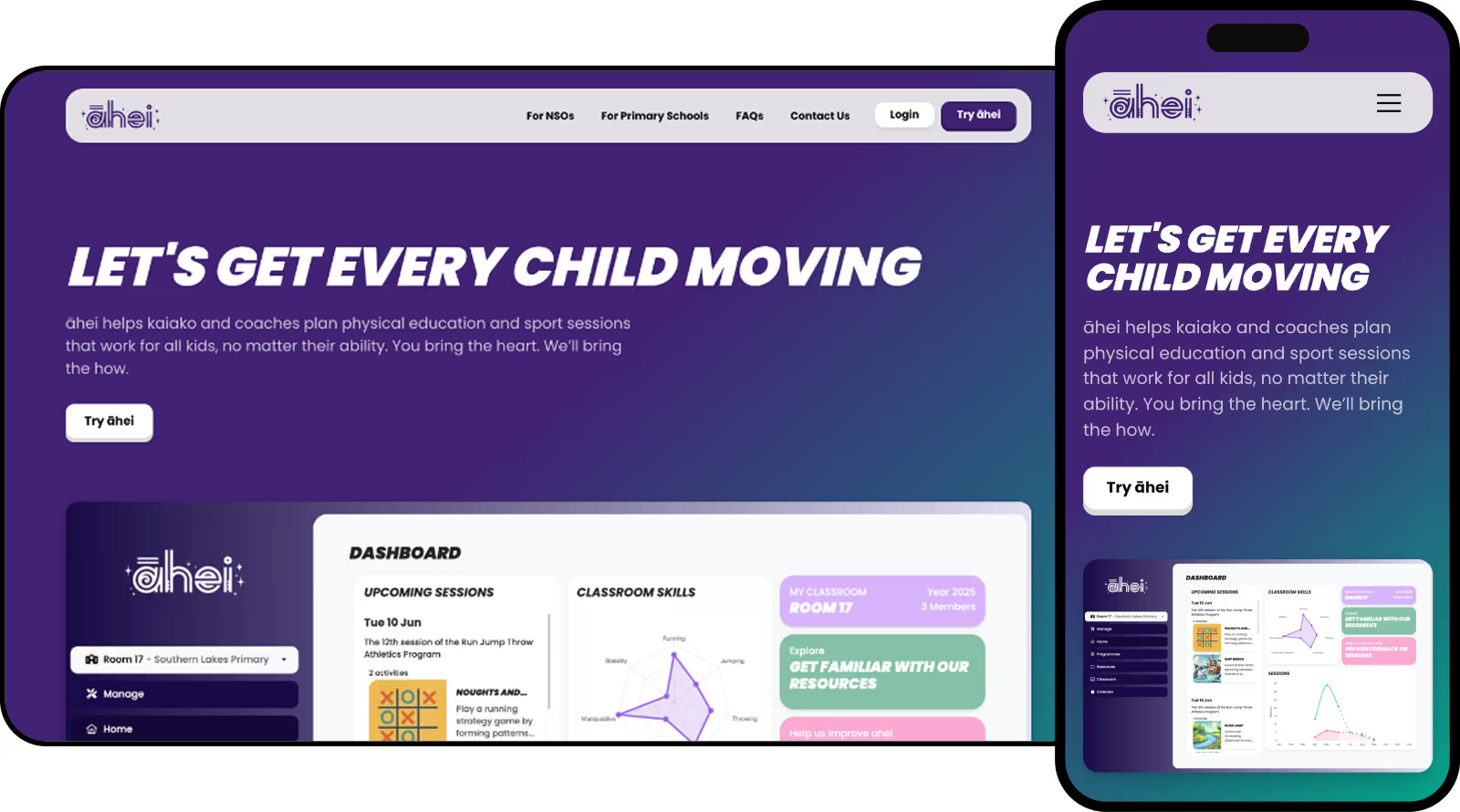
The Challenge: āhei is a new app launched in 2025 designed to help teachers plan inclusive PE and sport lessons. They came to us via referral, initially unaware of the StoryBrand framework. They were solving a deep Internal Problem: teachers felt "overwhelmed and unsure" about how to cater to students of all abilities. They wanted every child to participate but struggled to create effective plans for everyone.
The StoryBrand Fix:
- The Guide's Authority: To build trust instantly, we highlighted a crucial fact: the platform was founded by Paralympic athletes. This proves they understand inclusion better than anyone else.
- The Success Bucket: We shifted the messaging from features to outcomes. We promised that by using the app, teachers would see "every child grow in wellbeing, teamwork, and confidence."
- The Result: The messaging is now so clear that the app has been adopted in over 600 New Zealand primary schools.
6. Paysquad (FinTech)
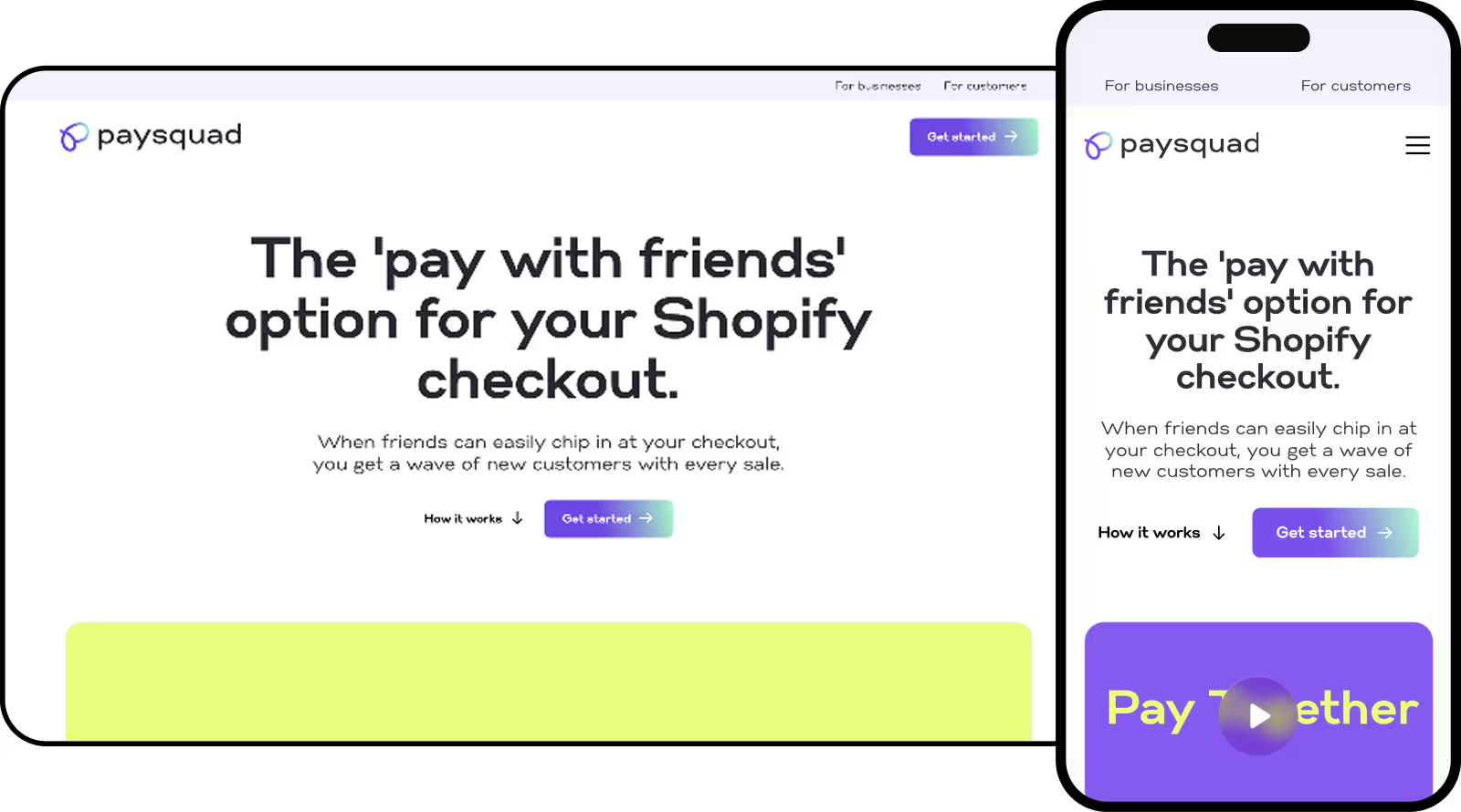
The Challenge: Paysquad required a suite of landing pages to announce their availability on Shopify. They also needed specific pages targeting distinct verticals: Retail, Travel, and Ticketing.
The StoryBrand Fix:
- One Page, One Purpose: This is a perfect example of how StoryBrand applies to landing pages. We didn't clutter the Shopify page with travel info. Each landing page followed a singular narrative arc designed to convert that specific user.
- Group Purchasing Simplified: The concept of splitting payments at checkout can get complicated to explain. We used the framework to break it down into a simple 3-step plan, making the complex technology feel approachable and easy to install.
From Book to Build: Bridging the Gap
Looking at these examples, you might notice a pattern. None of them started with "Let's pick some nice colours." They all started with a strategy.
If you have read the StoryBrand book and are trying to DIY your website, you might be tempted to jump straight into a website builder. Don't.
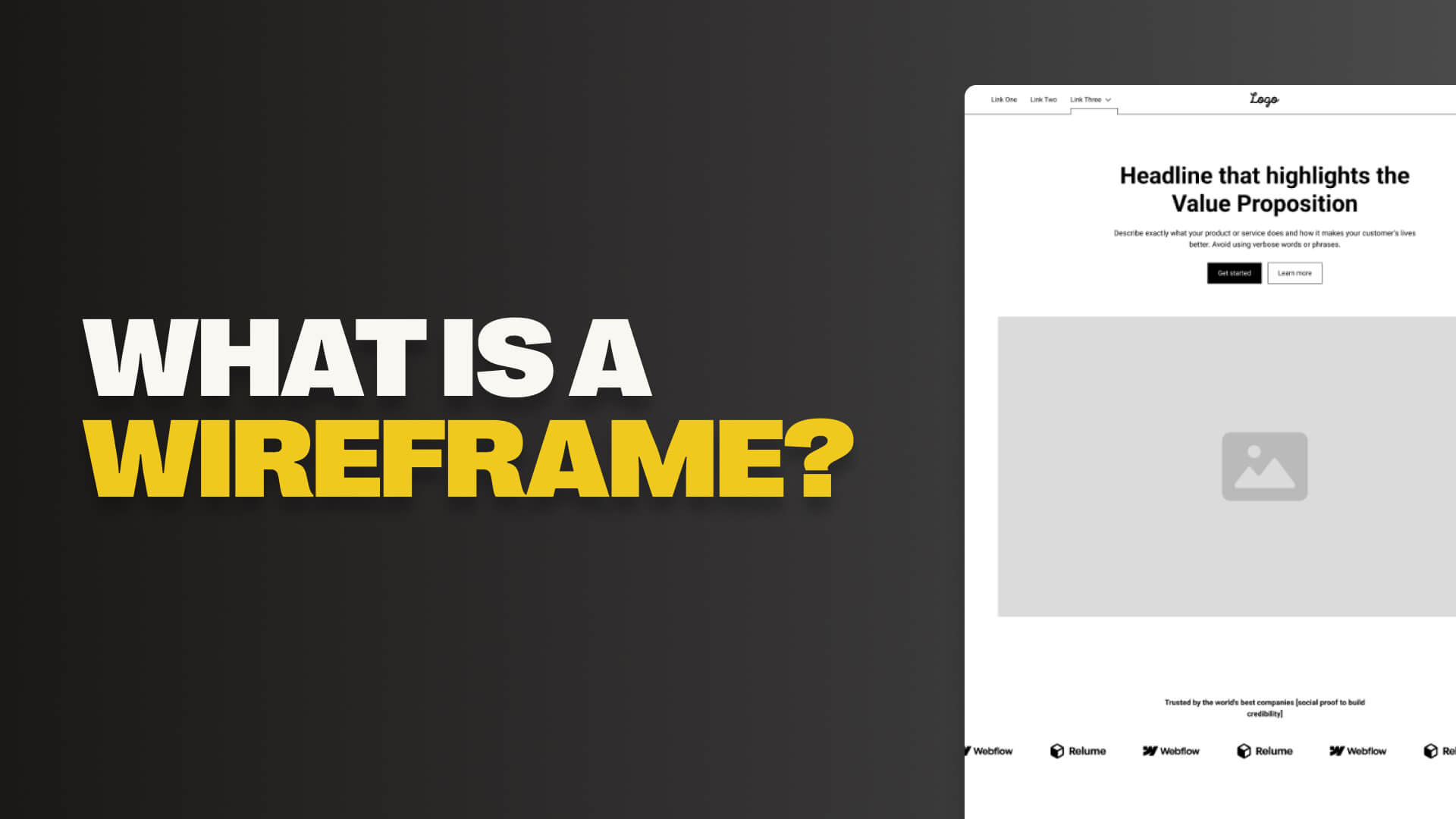
The missing link between your BrandScript and your Website is the Wireframe.
This is a low-fidelity architectural drawing of your site where you place your text and buttons without getting distracted by colours and photos. Once the wireframe works, then you design.
If you’re looking to overhaul your website, there are generally two ways we can help you, depending on how hands-on you want to be.
Done-With-You: StoryBrand Coaching
This is for the business owner who wants to master the message themselves but needs an expert guide to keep them on track. We don't just offer a single hour of advice.
Our StoryBrand Coaching is comprehensive.
We work side-by-side with you to build out your entire BrandScript, develop your wireframe strategy, and plan your marketing funnel.
You leave with the skills and the assets to own your marketing.
Done-For-You: StoryBrand Implementation
This is for the business owner who understands the value of the framework but simply doesn’t have the time to execute it.
In our Implementation service, we take the weight off your shoulders.
We write the copy, design the wireframes, and build the final high-converting website for you. We build every header, button, and paragraph to help you increase conversions and grow your business.
Ready to clarify your message? Contact us today to discuss your project.

Receive the Mammoth Marketing Memos
Get weekly insights delivered straight to your inbox from New Zealand's StoryBrand experts
.avif)